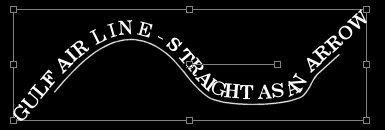
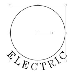
What we are going to do is letter the bottom of the Circle first, and then the upper part last. There is no need to do it this way, and you can do the lettering in either order. What I am going to show you is how to make lettering in a circle, with the bottom portion readable without having to turn on your head to read it. It is very easy to create lettering in a circle where you have to turn upside down to read the lettering at the bottom.
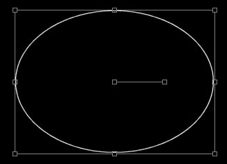
The first thing to do is create a canvas, and then draw a guide line. In this case, I used the Preset Shapes and made an ellipse (which is actually a circle if you hold down the Shift key as you draw it).
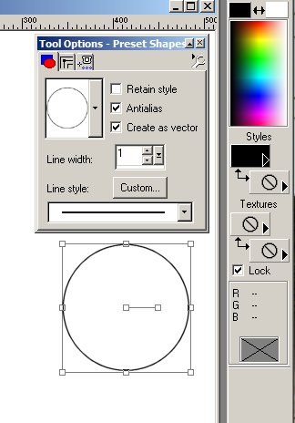
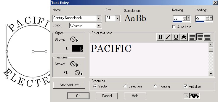
Notice that the "Antialias" and the "Create as vector" boxes are both checked. Also note that the foreground Style color is black, and the background is a Null. The foreground could be any color. Because the circle is a vector it has nodes shown, as well a handle. You can use the nodes to size the circle and the handle provides a way to rotate the drawing.
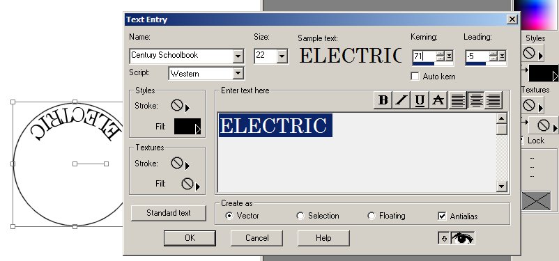
Next, click on Image | Flip. When you do, the Circle will jump to another part of the canvas, and also will be turned top for bottom, although you can not see that this has happened. The next step is to insert some lettering. Because we flipped the Circle, this lettering will start out being backwards, and at the inside top of the circle. But we will soon use the handle to rotate it to the bottom, and then it will read correctly.
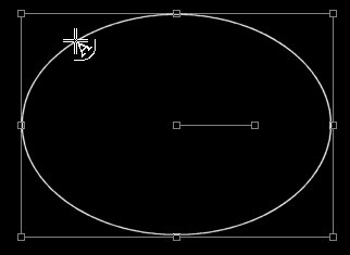
First you must interchange the foreground style with the Null. If you do not, then depending on your font, the lettering will be quite thick. If you like, you can also change the color. Then click on the Text Tool, and move the cursor over to the perimeter line of the Circle. It will then change into a funny Cross with an "A" in the lower right quadrant when you are in an appropriate place. It does not seem to matter where on the Circle you click, so long as you have the funny Cross. For reasons I do not understand, I am unable to capture a shot of this cursor. (I later found out how-see below: Other VECTOR Lines).
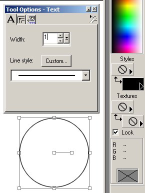
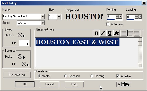
Now the Text Entry box will open, and you can chose a font, and size for your lettering. The spacing for the lettering is controlled by the amount of Kerning. The closeness of the lettering to the line is controlled by the amount of Leading. Make sure you check the Antialias and the Vector boxes. This lettering will end up at the bottom of the Circle.
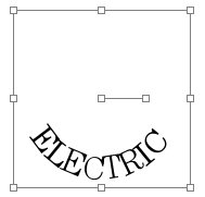
Often the lettering will refuse to follow your instructions, and you must start over several times. When it does behave, you can move the Text Box over to the side so you can observe what is actually happening. When you are happy, click OK.
I have discovered some things that may help with the lettering and its spacing. If you cannot get the Kerning and Leading to work properly, try Canceling out of the Text Entry tool, and doing it over. If that doesn't work, and often it won't, then change the Kerning and Leading to what you think may be correct, even though nothing happens on the main canvas, and proceed with the wrong spacing and click OK. Then on the main canvas, where the spacing is wrong, hit delete. Now go back to the Text tool and try again. This often resets Text Entry, and allows you to make the desired changes in the Kerning and Leading boxes.
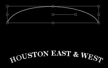
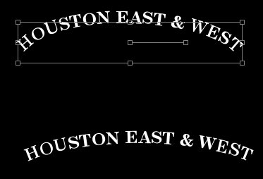
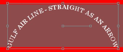
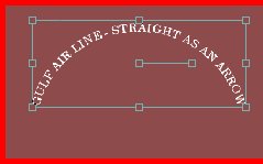
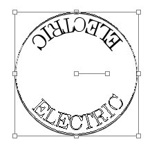
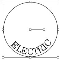
The Text Entry box will disappear. You may now rotate the text, by grabbing the handle, and pulling it around. You will know you are in the right place because double-headed arrows will appear next to the right of the node handle. Again I can not capture the cursor, but the left photo shows the text rotated. And the center one shows what it looks like after you release the left mouse button. The right photo occurs when you right click the mouse - the nodes are all gone.

You must do this, or nothing works correctly hereafter.
Now the next step is to remove the Circle, and this is another mysterious procedure. You use the Object Selector tool. It is the last tool on the toolbar. Click it, and then go over to the Circle, and left click on the Circle, not the text.....
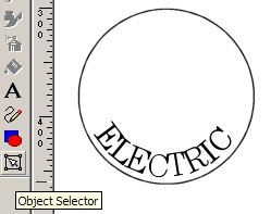
Suddenly the nodes reappear, but they are hopefully the nodes for the Circle and not the text.. Now right click in the general area and up pops a new screen, which is un-named. Down near the bottom is an entry called Properties
, click on it. Now you
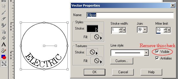
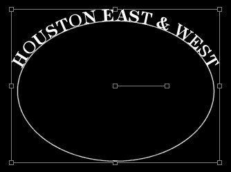
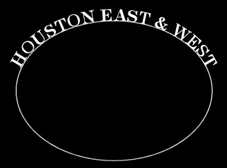
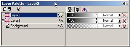
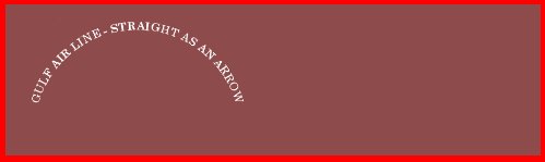
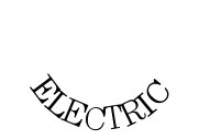
have a new box named Vector Properties. You will know if it is correct because it says "Ellipse" in the Name area. Remember, this is the Preset Shape you started with. If it does not say Ellipse, there is a problem, and you must back up. Uncheck the Visible box, and click OK. When you do, the Circle disappears and you must now remove the nodes by left clicking again. All you have left are the letters in an arc at the bottom. At this point, look in the Layer Properties box, and see what it shows. It may well be that you need to create a new vector layer for further lettering that will also be at the bottom. But for this exercise it is not necessary. Just remember this point when you create more complex shapes in the future. Now lets proceed with this exercise.
You are ready to go forward and add the upper letters.
So, use the Preset Tools, and draw another Circle. Approximate the size of the earlier one, less the lettering. Thus, it is a smaller Circle. Since it is created as a vector, it will have the nodes and a handle, as before. Use the nodes to adjust the size and position of the Circle, so that it fits inside the lettering, as in the next photo. To keep the shape of the Circle from distorting, use the right mouse button to do the resizing by moving one of the corner nodes. Now it is time to activate the Text tool.
The steps hereafter are the same as before, except you do not flip the image. So place the Text tool cursor on the new Circle, and left click. Up pops the Text Entry box. Type in the upper lettering, and adjust the Kerning and Leading
boxes so that the lettering looks correct. Notice that the Styles Stroke and Fill colors have been changed, just as before. And again, often the lettering does not want to behave, and you have to start over again. Or, you may be forced to install the misbehaving lettering, and then deleting it, as mentioned previously, which often serves to reset the Text Entry Kerning and Leading boxes. When you are happy with the looks, then click OK and remove the nodes by right clicking. Then click on the Circle with the Object Selector tool, and follow the previous steps to remove the visible Circle, and any nodes that show up. And you are done.

What to do with your new circular lettering is another story, which I will attack shortly. This technique can also be used to make lettering about an Ellipse, or most any other vector line that you might draw.