A good approach to texturing is to establish a rule of steps and techiniques that will applied to almost all parts of the same texture. The reasoning behind this is to facilitate uniformity. Unlike a traditional illustration where you can see the image in it's entirety, a texture map is a composite of different pieces that makes up the whole.
What I do is to think out exactly what it is that I want to achieve. Then I establish a list of definite steps that will be applied for every piece of the texture map in exactly the same order. This way I can work quickly and at the same time there is the confidence that, other then a few minor adjustments, everything will look right when it is put back together on the model.
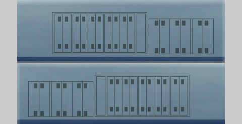
I started off by masking off the panel details. Then saving the mask.
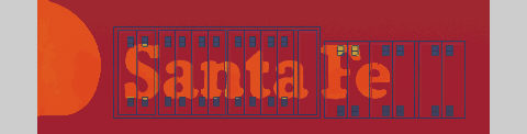
The mask is used to create a new layer on which the panel lines exist. These are paint black. I then proceeded to paint the background using a graduated fill. The light tone uppermost with the dark tone at the bottom.
The CSX blue line is added in a solid band. Using the gradient tool I highlighted the top with 70% transparent white. The panel lining was then fixed back to the main area as a 50% transparent overlay. Loading the mask of the paneling that I save earlier, I created new copy of the panel lines. This was isolated to its own layer and "locked" to prevent accidental changes.
I copied the entire area to a new layer and applied a cloud filter. This was then fix back to the original area as 75% transparent overlay.
At this point I copied the entire side, flipped it horizontally. This is then used for the other side of the rear hull. I chose to do this step at this point because of the 45º Rule with regards to lighting direction. For a lot of illustrations, artists make the assumption that light is shining on the object being drawn from an angle 45º to the left and above the object being rendered. If I copied the side after the highlighting was done and then flipped it, the highlights on the second panel would be wrong. So in the interest of visual consistency I copied and flipped the first side to create the second side before highlighting was done.
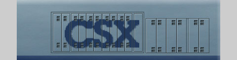
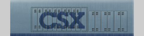
Refocusing on the first side, the logo was prepared seperately from the clip art I scrounged off the Web. It needed some cleaning up before it could be used as the original was a GIF and had poor anti-aliasing. Once the clean-up was done the logo was brought over, reduced to the correct side and positioned. I then "feathered" the edges of the logo slightly before fixing it in place. The copy of the panel lines I saved earlier was overlayed at full strength on top of it. (I saved an extra copy of the panel lines for use on the other side).
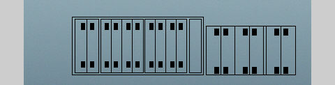
Highlighting was done next. This was done with the pencil tool using white set at 70% transparency. I drew one latch, then copied and pasted the rest using the grey rectangles as positioning aids. It really helps to zoom in close when doing any detailed work.
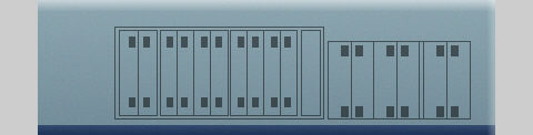
The final step was to copy the entire completed side. Treating the copy to a fairly strong blast of "wind" - a plugin that is available in Photoshop and Picture Publisher. A good substitute is the "motion blur" plugin. This was then fixed over the original surface as a 75% transparent overlay. The prototype is not that dirty, so all I wanted to do was to suggest some light weathering and to tie everything together smoothly without blurring the details.
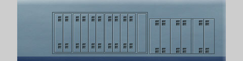
The same steps were applied to all the other main upper hull areas. Other than adjustments needed to align the lines, it all went very quickly and everything was done in an evening at a relaxed pace. SVIEW (and MakeAceWin) really helped as it allowed me to hop back in to view the textures on the model to check alignments with the minimum of fuss.
For more weathering ideas and techniques please refer to the Locomotive Weathering Tutorial.
[ Top of Page ] [ Prev ] [ Next ]
Copyrights © 2004-2007, Sean Lim. All Rights Reserved. Hosted courtesy of steam4me with permission.